E-commerce Churn Analysis
Objective of data analysis is to extract insights from data; then assist in decision-making. This can be achieved by analysing data and asking the right question; gaining insights and answers from data. Everything is then reported and presented with solution recommendation related to the problem at hand.
So, what is churn? Churn is defined as ‘number of users that has stopped using a service; in this case the service is ecommerce platform. The company behind the ecommerce platform wants to know their user churn condition. They wanted to know when and where people would drop their platform; if there are any clear differences in user characteristics between those who are classified as churn and aren’t.
Note: This analysis is the first part of a 2-part project: second part here.
Info: View the full notebook here.
Computing Churn Rate
Starting off, the first thing to do is calculate the overall user churn rate of the company. This is achieved by dividing the total churn user with total user (churn user / total user).
From the data we gather:
- Total User: 5630
- Churn User: 948
- Retained User: 4682
- Churn Rate: 16.84%
- Retain Rate: 83.16%
Knowing this beforehand gives context to how high/low the company’s current churn rate is.
“ . . . there is a global opinion for an ideal churn rate to be 5%.”
Analysing User Churn-Tenure Relation
Since user churn is basically user retention (they are directly inversely proportional); a problem with user churn is the same as a problem with user retention.
Retention itself is about ‘time frame of a user staying/keep returning’; the tenure of users. This means, user churn is directly related with user tenure. Having this in mind, analysing churn and tenure together will give us insight of how our user behave in the retention funnel.
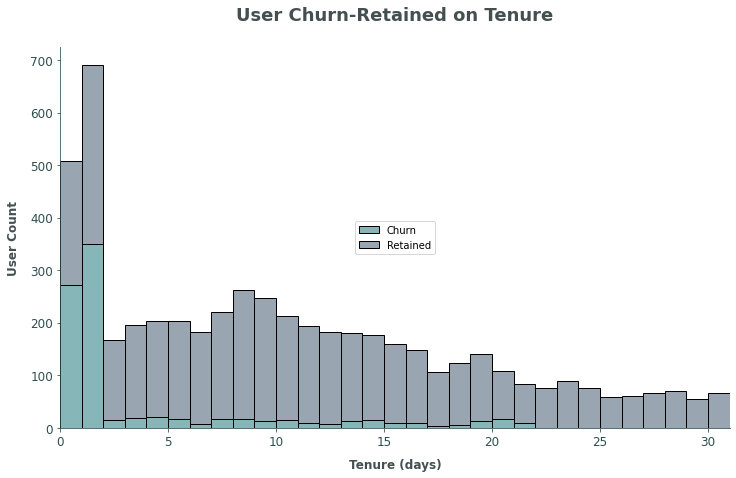
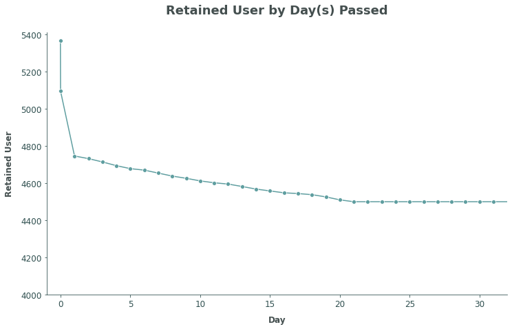
Alternatively, the data can also be plotted to represent user retention; if total user in the timeframe is assumed as the initial user count.
From the chart above, it is clear that a lot of churn users are on their 0-2 day on the platform; this is a recurring problem with digital platforms.
- Total Churn Users: 948
- Churn Users (Tenure <= 2): 635
- Churn Users (Tenure > 2): 313
- Percentage of Tenure <= 2 Users: 66.98 %
(Tenure <= 2 / Total Churn Users)
Since the breakpoint for the churn rate is on 0-2 day, there are 2 possibilities where the problem is at: (1) sales funnel – completing purchase; (2) retention funnel – loyal user conversion. A brief skim through the data shows that all users have a minimum of 1 purchase complete; there are no problem with user’s first-purchase; it is a retention funnel problem.
Finding User Characteristics
With the information attained from analysing Churn-Tenure data, the users can be split into 2 segments:
- Churn Users: users that are churn and on their 0-2 day;
- Retained Users: users that stays for longer.
Going forward ‘Segment’ will refer to this segmentation and used as a base to analyse user characteristics.
Correlation
To help with determining which feature to analyse, using correlation heatmap could help in checking each feature’s correlation with target. ince the data’s features are a mix of numerical and categorical value, there is a need to separate both types to their own dataframe and calculate their correlation separately. Uing Pearson’s Correlation for numerical data; Chi-Squared method for categorical data.
Note: Correlation is by no means equal or the same as causation. This article explained more in-depth about correlation vs. causation.
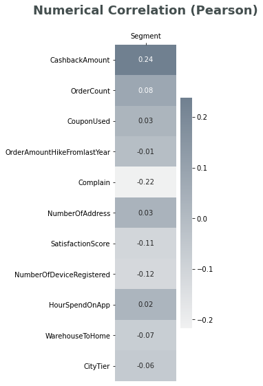
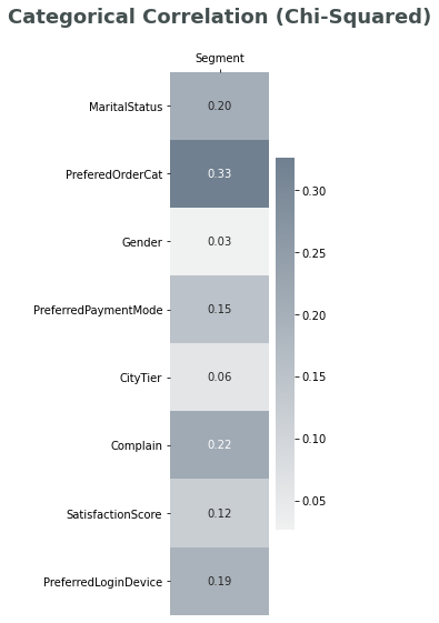
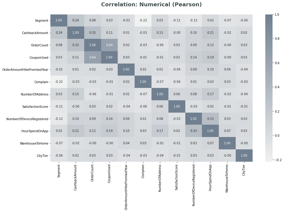
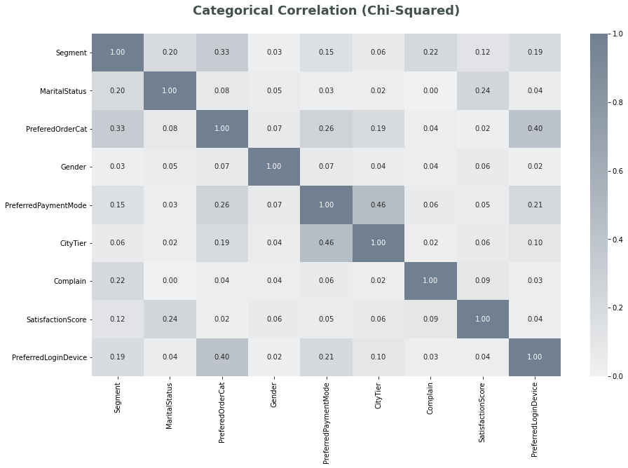
From the correlation calculation, top 5 features with highest correlation are:
- Preferred Order Category (0.33)
- Cashback Amount (0.24)
- Complain (0.22)
- Marital Status (0.20)
- Preferred Login Device (0.19)
However, choosing features solely based on correlation is not advisable. For example feature like Marital Status is something that’s innate to customer and there is no action that could be taken. On the contrary, even though correlation scores are low; features like Satisfaction Score or Hours Spend on App are interesting characteristics that are related to how the user perceive/use the platform.
Insights - Features Analysis
Considering how much a feature is relatable to the target (churn) and their correlation score, the selected features are:
- Preferred Order Category
- Cashback Amount
- Order Count
- Hour Spend on App
- Complain
- Satisfaction Score
Preferred Order Category
As defined by the dataset, this feature shows what is the preferred order category of customer in last month. From this feature we can gather which category is popular and what are the user’s churn tendencies based on that.
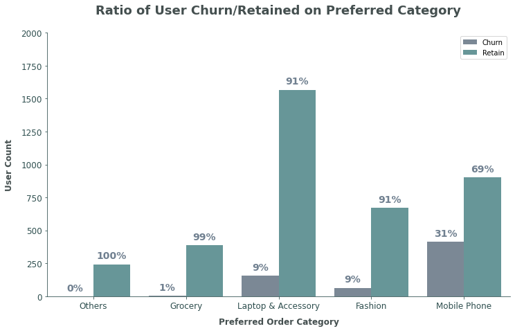
From the chart it is clear that the category ‘Laptop & Accessory’ is by far the most popular; ‘Mobile Phone’ has the highest churn tendencies.
Cashback Amount
This feature shows how much cashback has been gained by the user on the pass month. Since there is no data on user’s spending, we can use user’s cashback gained to assume their spending. Higher cashback gain means more spending.
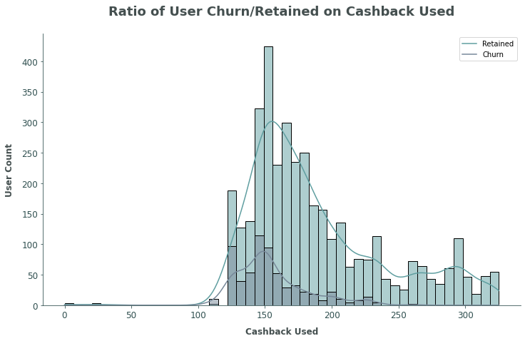
The chart above shows the distribution of cashback gained by the users; churn users have a lower peak cashback gained and the fall off from its peak is steep (concave parabolic); retained users have a higher peak cashback gained and the fall off from its peak is more linear.
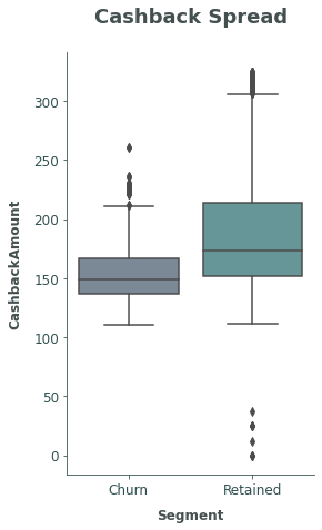
To help visualize the distribution, the boxplot above shows that retained users tend to have higher cashback gained. The median cashback of retained users are significantly higher than churn users, going above churn user’s cashback on Q3.
Order Count
This data tells how many separate orders have been placed by the user in the previous month. The fact previously stated that all users have completed their first purchase is based on this data.
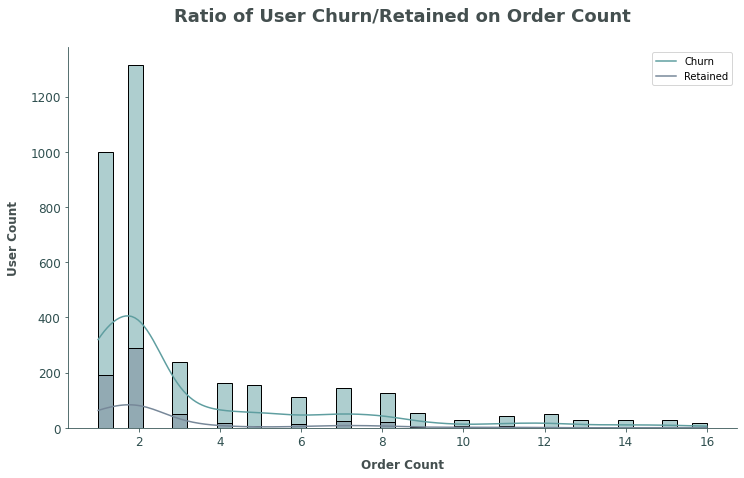
From the distribution there are no clear difference between churn and retained user’s order count. Both segments’ users are leaning towards 1-2 orders and then fall off on higher order count.
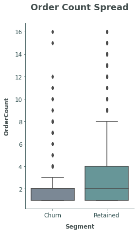
The boxplot confirms what the distribution plot shows; that churn and retained users have tendencies of 1-2 order count, however retained users lean more to order more (positively skewed).
Hour Spend on App
Hour spend on app depicts how the user based is using the platform (app and website); how long do users use the platform on average. This feature can show how engaged the users are when they are using the platform.
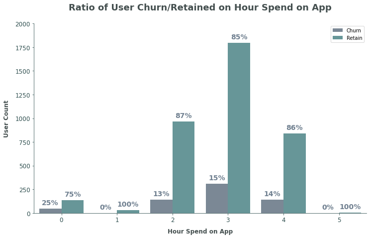
Most of the users spend on average 3 hours using the platform. On the exception on users that spend <0 hours on the platform; there are no clear pattern on how hours spend on platform would affect user’s churn or retention
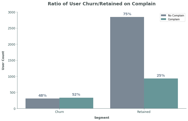
Complain
The complain recorded are only if users have done any complain during the past month; there are no count of how many complain has been filed.
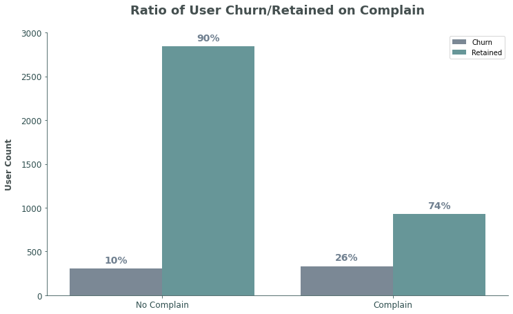
On the chart above it is instantly clear that users that hasn’t filed any complain have a very high retained percentage; which is very intuitive. Using the same data but visualizing it differently, the chart below shows that churn users’ tendency to complain is very high >50%.
Satisfaction Score
Satisfaction score that is recorded is only about the satisfactory score of customer service; not totally unrelated to the company, but it is unrelated towards the platform’s performance.
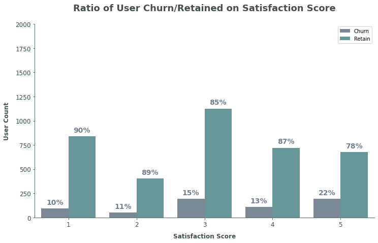
The results are quite questionable; where the pattern shows that the higher satisfaction score actually have high churn rate; it’s very counter-intuitive.
Cross Referencing Features
Having analysing and gaining insights from the selected features, it is important to then cross referencing the findings across features. This way it is possible to gain more insights and find out relationships between insights.
The feature that needs to be cross-referenced is ‘Preferred Order Category’ with other features. Analysing this feature didn’t give enough information on why users tend to churn more if they prefer to order on certain category.
- Preferred Order Category vs. Cashback Amount
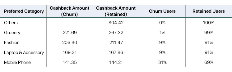
- Average cashback amount on ‘Mobile Phone’ category is very close with the average cashback amount of users with churn tendency (148.98 and 144.21 respectively).
- The other categories’ average cashback amount is closer to the average cashback amount of users with retained tendency (173.41 and 167.86 respectively).
- Preferred Order Category vs. Order Count
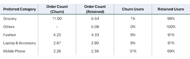
- Even though there are no clear difference between churn and retained user’s order count on earlier analysis, through this data it shows that categories with lower churn rate have higher order count.
- Analysing further, the feature
PreferredOrderCategorymeans that the user has more order on the specific category compared to others. If the user has 2 order count, it means both orders should be on the same category for it to be the preferred category. - Since categories other than ‘Mobile Phone’ have >3 order counts, this means that the users would have done order in at least 2 different categories.
- Preferred Order Category’ vs. ‘Hour Spend on App
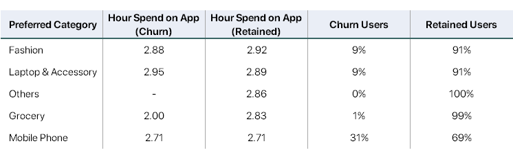
- While category with higher churn rate have lower hour spend on app, the difference is negligible and doesn’t mean anything.
Conclusion – “Aha! Moment”
From gathering all the insights, it is possible then to determine user characteristic towards the target, churn. However, instead of defining the characteristics of users that have churn tendency; defining users that will retain will be more engaging. The major insights that have been gathered, the characteristics of users that will retain are:
- Complete order on more than 1 category.
- Gained >170 cashback from purchases; this also reflects to the total spending amount. (e.g. in this case if cashback is 10% then the total spending would be 1700).
- Spends >1 hour on the platform.
- Did not file any complain. These points then could be defined as the platform’s “Aha! Moment”, a set of actions or characteristics that separates users who find value and will stay (retained) on the platform from those who won’t.
Recommendations
All the characteristics from the defined “Aha! Moment” are around the initial engagement when users newly joined the platform; the recommendation then will address this accordingly.
- First thing is to guide users to explore more of the platform, to enable them to check on different categories. This could be achieved through a lot of ways, the simplest one is to introduce the platform to new users through a tutorial. The tutorial will be focused on exploring how to use the platform’s app, features and the categories available. Having a simple tutorial like this will also indirectly make users spend more time on the app. Accordingly, users going through tutorial would help the users to understand more of the platform which could reduce the likeliness of complain being filed.
- Second is to promote users to spend more, do more purchase, or use more cashback. Following up from the tutorial, with the user exploring more of the platform, it is possible to then design a recommendation system based on the user’s behaviour on their tutorial. With this, the user would then lean towards spending more based on the recommendation that fits them.